I'm never at a
loss for
words ...
THE BLOG
Seven things I learned creating my website
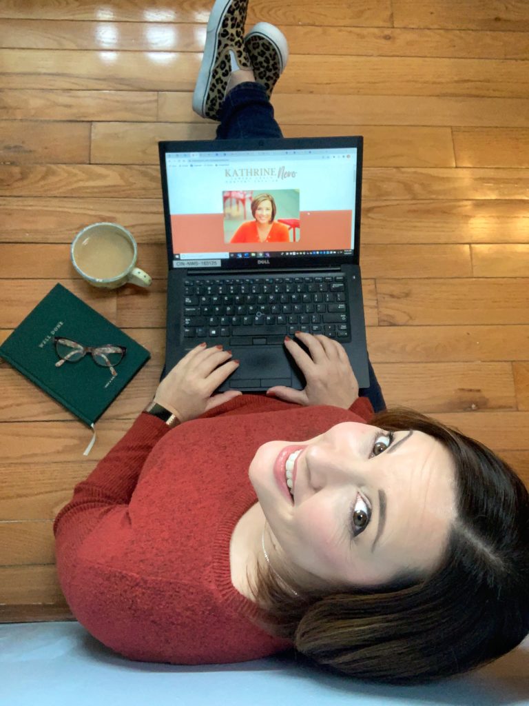
We look at websites ALL. DAY. LONG. But that doesn’t mean we know what makes a good one. So, after trial and error and consulting the experts, here are the seven things I learned creating my website that will help yours stand out – and more importantly, get you business.
PHOTOS, PHOTOS, PHOTOS.
That’s in all caps for a reason. You need BIG ones. And lots of them. When you think you have enough, you’re wrong. You need more.
My friend Tasha Pinelo is a brand photographer and let me in on this little secret early on. And boy, was she right. You don’t need a professional photo shoot, but it will alleviate a whole bunch of headaches.

My business sells a service: learning confidence on camera. I literally use a laptop and some lights. Not a lot of props to work with. But brand photographers use their creativity to tell the story of your business through photos. They plan shoots by using your tools of the trade. Like when I was talking about getting rid of my landline, Tasha suggested using this old-school corded phone to tell the story.
Brand photographers find out your “why?” even if you’re not quite sure of it yourself. All of this translates into really useful images that further your brand and your expertise, helping you conect with your ideal client. Plus, they’re thinking of how those photos will be used. Will they be offset with text on one side? A hero image? Background photos?
I’m a big fan of MacGyvering everything I can in my business (I put together my own website, for goodness sakes), but investing in a photo shoot allows you the flexibility to do anything you want with your website, without the limitations of photo size, quality or quantity.
Make your menu simple
Ever been to the Cheesecake Factory? You’re probably still reading that menu. It is OVERWHELMING. So let’s not let that happen on your website. Initially I had eight menu tabs on kathrinenero.com, but after learning from several website experts, I reduced it to the current five. I did add some drop down menus, though, so everything is segmented out nicely. But upon first glance, you aren’t confused by where to go.
Check that. Make everything simple
This is where I struggled a bit. Nothing in my life is simple, but I made an exception for the website. Experts say to keep your font selections to three or fewer, and the guidance is pretty similar on brand colors. Three to five seem to be the sweet spot.
And here’s a tip I thought was genius: make all of your call to action buttons the same color. Make sure the color you choose works with your brand colors, but don’t use it anywhere else on your site. That way, it stands out – and when people are ready to buy, connect or sign up, they know exectly what they’re looking for.
Keep your social media buttons in the footer
“But wait, ” you’re saying, “Don’t I want people to see them at the top of my site?” Sure – if you want people to land on your site and immediately leave. You’ve worked this hard; make them stick around for a bit while they look for those suckers.
These last few items were some of several nuggets I gleaned from listening in on website audits on Clubhouse, the new social media app. Website experts are there, taking live looks at your website and suggesting ways to improve SEO, make it more user friendly, and more pleasing to the eye. It’s a treasure trove of live, personalized information that’s tough to get anywhere else. So hop on and check it out (and follow me while you’re there!).

Have a privacy policy
It’s literally the law for many businesses, but honestly, this is one where you need to do your research. It all depends on what information you collect, where you are located and what you sell. You can copy and paste a generic one, have a lawyer put one together for you, or use these tips from the Better Business Bureau to craft your own. But you better have one.
Write in a you-focused voice
It’s really easy to make your website about you. But really, it should be about your prospective client. What do they feel? Which pain points do they have? What transformation do they want? How can your product/service help them? Consulting a copy editor can help here. But if you’re a DIYer, put yourself in the shoes of the person you want to attract and write so that it appeals to him or her.
Now, there is a time and a place to toot your own horn (helllo, about page!). People are clicking there specifically to learn who created this awesome website. But beyond that, ditch the “I” and focus on the “you.”
Grab another set of eyes
Even after the hours you spent crafting the perfect site, there are still probably a few hiccups. A broken link here, a typo there. Have a couple of people check out your site – on desktop AND mobile and click around to see what works and what doesn’t.
Are the fonts the right size? Do the pictures load quickly enough? Does the mobile version work well?
If there’s someone in your world that isn’t the most technologically savvy, that’s the person for this job. If they can navigate your site, anyone can.
And just remember: your website isn’t finite. It’s a living, breathing thing that can be updated, changed and massaged for as long as you’d like to tinker. But don’t be afraid to hit publish! Get it out there and let it work.
Hey, while you’re here, do a little clicking and check out my handiwork! And find out why it took me so long to create this website in the first place. wanna work together? Click here and see which service fits you best.